Friday, 20 January 2017

Digipak Draft


Front Cover
This is the draft for the front cover of my digipack, it features the three 'zombies' in a field. The image is inspired by a scene in the music video for the song 'Death'.
-Screenshot from 'Death'.
The album title and band name are written on the back of the central member's hoodie. This is written in pink to contrast the darkness of the image and to help suggest the psychedelic nature of the band's music. The image is dark to show the 'darkness' of their music.
I was unsure if I should include the chainsaw from the scene in the video, I eventually decided to because it reminded me of the classic zombie film series 'Evil Dead'. 

The colours and distortion on the right hand side are because the back cover has a psychedelic pattern on it and the back cover is going to bleed over onto the front cover.

This is the back cover of my digipack, I chose the psychedelic style colours and gradient as I think that it is very fitting with their music. I also put the 'wave' effect on the text to further increase the psychedelic style. The information for the record labels and copyright is written at the bottom and the barcode is beneath the tracklist.
The spine of my digipack features the gradient and colours from the back cover and uses the same font as the front and back covers. I included 'present' instead of just having the title and band name as I think it is quite unique and seems professional, it also seems like an old film and the Flatbush ZOMBiES often include intertextual references to film in their work. The 'present' also links to the advert which says the same thing.

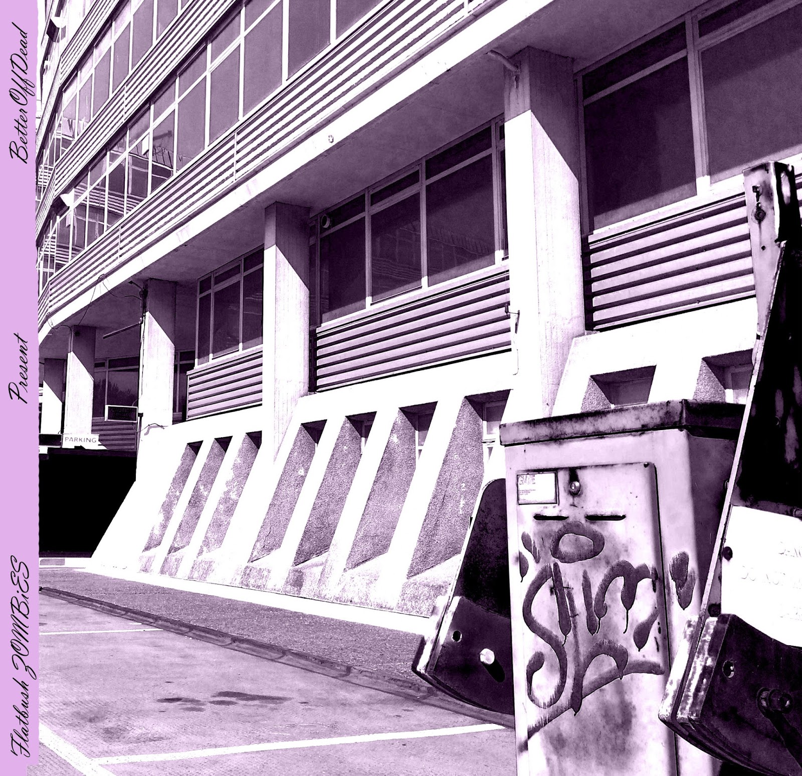
This is the inside fold, the spine features the same text as the other one but is purple to match the image on the inside. The image is of an abandoned building I found and a broken barrier with graffiti on it. I increased the contrast to give the graffiti and shadows an interesting effect and then made the image black & white and added a pale purple filter. The colour purple is often linked to hip-hop especially recently as many famous rappers drink an illegal drink called 'Lean'.


I decided to change the spine and carry on the theme of the back cover bleeding over.

Complete view of 1st side of digipak


This is where the spine would be but on the inside, it is influenced by the cover of Kanye West's '808's and Heartbreak'. I decided to make a black & white version to convey the darkness of the group's music and one that is the same colour as the gradient on the outside of the digipack.

- Kanye West's '808's & Heartbreak'

This is one of the inside panels of my digipack, it represents the 'hood' and how people are trapped inside it, this is shown by the fence which even makes it look almost prison like, this photograph would go by the black and grey spine. I made the image black & white so it seemed darker and more entrapping, I then added a filter to make it look more professional.
 This is the inside (minus the central piece), the image on the left is supposed to contrast the image on the right as it shows freedom and the bright-lights of fame. the colours are also quite psychedelic which fits the group's style and the coloured dashes are on this side.


This image will be under the disk and the disk will be printed so that the buyer can move his disk to create either a cross or an inverted cross.


This is the disk to the album, it will fit in line with the lines on the paper behind it. It will be a matt black colour with the purple which will be shiny.


Complete inside view - I added some crosses to carry a theme through. The cross on the right represents the fact that when people are trapped in hard times they look to things like religion whereas the one on the left represents the fact that when people get big and famous they leave behind religion.

Friday, 13 January 2017

CLPPNG Digipack - Clipping

The image from the cover of this album runs across three whole panels. The image is very unique for an album cover which is fitting as Clipping's music is very unique, the image is also quite distorted which fits their music as well. The back cover features the label's logo, the barcode and the legal/copyright information. The track list is on the inside of the case but continues the image from the outside.
The inside of the case features distorted images of the band, which continues the link to the band's distorted music. The inside, like the outside, is very minimalist which also fits the bands music as they have some extremely minimalist songs.

3001: A Laced Odyssey Digipack - Flatbush ZOMBiES

The cover of this album features a brightly coloured cartoon image, this fits very well with the bands 'druggy' image. There is also a checked strip down the side which is very eye-catching. The Cartoon features images like a tank, the devil and a savage dog which fit well into the violence that is frequently included in the lyrics of the band's image.
The album title and the track list are on the back of the album and are written in a handwritten style. There is also bandana style patterns around the edges and some legal information at the bottom.
The booklet is actually stuck to the inside which is very unique and feels more professional than when they are usually just slid into a card slot. The inside cover continues the theme from the outside, the bright pink and the bandana pattern which fit well with their 'druggy' style and hip-hop conventions. The disk also features 'peace symbols' which fit with their drug related image.
Behind the disk the names of the artists are listed as well as the credits for the people who helped with the album and the artwork. The group also include a personal message of 'OPEN YOUR FU*KING MIND' as they sometimes include meaningful things in their song and are trying to get people to open their minds to the things they are trying to say. It also states that the group is from Brooklyn which they are very proud of and that the album was recorded at the north pole.


The Powers That B Digipack - Death Grips


The album features a floor light with Death Grips scratched into which suits their image well as they are very aggressive musically. The back cover features a heavily distorted screenshot from one of the group's music videos as well as the album title and the legal information and also the label logos.
The images from inside are very minimalist, one just says 'Jenny Death' and the other says 'Ni**as On The Moon' and features an image of one of the group's members. 'Jenny Death' and 'Ni**as On The Moon' are the names of the disks that together make 'The Powers That B'.
The images on the far left and far right feature an image of the same thing, a 'real' leaf within a computer screen that has an editing software on the screen, but one of the images is from below the leaf and one is from above. This is very strange and unique which fits the band as these words are commonly used to describe them. The track listings are written over these images.
The disks feature distorted images which links to the heavy distortion featured in the music that Death Grips make.
The images below the disks feature blank snakes wrapped around red egg-like objects. This fits the dark and almost evil style of the music that they make. These images are also very cult-like which links to the 'cult' following that the band have.

Watch the Throne Digipack - Kanye West & Jay Z


This digipack has ten sides and folds out in a + shape which is very unique, especially for a 1 disk album.  The front features a parental guidance logo and the back a barcode. The artwork was designed by Riccardo Tisci who is the Creative Director of Givenchy. The artwork features a lot of gold, gold is very often associated with the luxurious lives of the famous rappers so this artwork is very fitting. The fact that the art was designed by the Creative Director of Givenchy is also very fitting as Givenchy is a very luxurious clothing brand so fits in with fashion which is very popular in hip-hop, especially with Kanye West's 'Yeezy' label which has been very influential in the fashion world. The heavy use of gold and the link to fashion helps link the album to the fact that both of the rappers are very rich and successful and also to the consumerism that is common within hip-hop culture.

The inside of the album is a lot different to the outside as it is much darker, this darkness and use of the colour black, although different to the gold, is just as fitting within the aesthetic of the hip-hop genre. The fact that Jay Z and Kanye's faces have been merged with wild animals suggests there will be aggression on the album and the inclusion of the USA flag shows the pride they feel for their nation and also fits into Kanye's future intentions of running for president. The angel down the bottom also helps to show their faith, the use of an angel and the USA flag could also show that they are very faithful to both their religion and their country.


The spine on the sides simply say the artist names and the album title.

The spine along the bottom states the record label, information about the label, where the album is made, the artists websites and information and legal information stating things such as you can't make copies of the album and you can not use it for public performances.
The spine along the top states the names of the executive producers, the creative designer, the art director and some copyright information about the artwork.
The disk is just black with lines on it, almost like an expensive wooden finish. The disk has a matt finish which feels very high quality and fits with the theme of luxury that runs through the artwork. The underside of the disk (the actual plastic coating of the disk) is also black which is very unique.


Thursday, 12 January 2017

My Team SUPREME (Incomplete) (1st Draft) + Feedback


This is the first draft of my music video
The outro needs to be filmed so is blank and the other blank Sections of the video are areas that I need to re-shoot for reasons such as overexposure, imperfections or a lack of variety in my footage.

The comments section will also be open to peer feedback, the questions viewers are asked to respond to are
1. Do you think that the font used on the title cards is appropriate?
2. Do you think that there is enough variety in shot types?
3. Do you think that the video fits into the artists image?
4. Can you tell that when Meech's verse is being performed the character is supposed to be a darker version of himself than when Erick's verse is being performed? 
5. Do you have any other suggestions or feedback?


A user called TEASTERFORD 22 commented:
1. I think the font is great and fits well with the group's music
2. I think there are good shots but there needs to be more diversity
3. I think it fits very well, especially the 666 at the start and the costume of Meech
4. Yeah this is clear by the aggression and clothing
5. It's good, just put in more variety and show the drug side a bit more to help show the story


Nobody else commented so I asked some more people


One
1. Yeah, I think it has a cool style and fits with the group
2. Needs to be more
3. Yeah, especially the drugs
4. Yeah, I thought so
5. You could make it more interesting with more shots or effects or something.


Two
1. Yeah, its cool
2. needs more really
3. yeah, especially with the location for the second guy
4. yeah, because of the drugs and the same actor
5. more variety


Three
1. Yeah, especially the use of the red, it fits the almost evil image people associate the group with.
2. I would put some more in there, play with angles more like the canted shot of Meech crouching.
3. Yeah, especially because of the 666 and the outfits, maybe add some effects though.
4. Yeah, the aggression and the clothing/location show this.
5. Just add some variety and complete the missing pieces, plus maybe some effects or something.


The responses to question 1 shows that people really liked the font used for the title cards.


The responses to the second question are positive for the shots that are already included but tell me that I should include some more diverse shots too, I like this idea and will probably use some more diverse ones for the second rapper's (Meech's) verse to represent the feelings created by the drugs that he took.


Question 3's responses are very positive and make me glad that people think it fits well into the artist's image, I'm also glad people like the use off 666. The idea to use effects is good, I was even considering it before due to the psychedelic/drug-themed nature of the music, especially within Meech's verse.


The responses to the 4th question are positive and show that this element of the music video is going well.


The extra comments just further solidify the idea that I should use some more diverse shots and also show that lots of people think I should use effects which is further pushing me towards exploring this idea.