
Friday, 31 March 2017


Focus Group
I asked a group of non-media studies acquaintances what they thought of my media package, all responses are in response to the posts labelled as 'Digipak Final Edit', 'Poster/Advert Final Edit' and 'Music Video Final Edit'.
I asked them 4 questions:

I asked these questions because I thought they would give a good representation of peoples views on all three elements of my media package.
These are my Responses:
 I was very happy with this response because it showed that this person was able to understand the video well and thought that the digipak had a clear and recognizable theme across it. I was also very pleased with the fact that the poster/advert was received positively. The fact that the person thought that the products linked well was good as I was worried that the connections many not have been clear enough.
 I liked that this feedback showed that the video is clear and easy to work out, I was also pleased that this person recognized the signs of the bad character clearly. I was also very pleased that this person also thought that the digipak had a clear running theme and was happy that they liked the poster and thought it was interesting that they mentioned controversy as I had similar thoughts while designing it. The links are further backed up as being clear which is good.
 I was pleased with this response to my video and liked the fact that the person found it mysterious. I liked that they thought the poster was quite punk-like as this fits well with the controversy the Flatbush ZOMBiES are often in because of their lyrics. I thought it was interesting that they pointed out that the video links the least well as I thought this too.
Overall I thought that this feedback was very positive and I was pleased with the fact that people understood the narrative of the video. I was also pleased with the positive responses to the digipak and was especially pleased with the responses to my advert as I was unsure of how people would respond to it. The fact that people thought the products linked was also good as I was unsure if the links were clear enough.
I asked them 4 questions:

I asked these questions because I thought they would give a good representation of peoples views on all three elements of my media package.
These are my Responses:


Overall I thought that this feedback was very positive and I was pleased with the fact that people understood the narrative of the video. I was also pleased with the positive responses to the digipak and was especially pleased with the responses to my advert as I was unsure of how people would respond to it. The fact that people thought the products linked was also good as I was unsure if the links were clear enough.

Digipak Final Edit


I changed the front cover so that it had the cross on it and so that it was the same as the booklet as I thought this would be more striking and effective, I also thought that it would be better to carry this house style onto the cover as it has been used over the rest of the product.
Tuesday, 28 March 2017
What have you learned from your audience feedback?
My audience feedback taught me a lot throughout the project.
For my first draft the feedback showed me that people really liked the font at the start of the video, this caused me to keep the font the same as it had clearly been successful. The responses also taught me that people wanted a lot more diversity in shot types throughout the video, because of these responses when I shot more footage I included more diverse angles and framing, particularly during Meech's verse as I thought it would emphasise the drug use and evilness of the character. I also found out that people really liked the style and thought that it fitted the artist style and image well, I was happy with this, however they did say that using effects would be a good idea. I had previously considered it but other people mentioning it spurred me to do it, this is why effects are used in later edits of the video, particularly in Meech's verse as I thought they would represent the drugs/psychedelic nature well. People could also tell that the video was about one person who had turned bad which was good as I was originally worried many people would not understand.
My feedback for the second edit of my music video further solidified that it is suited to the genre of music which was very good. Although previously many people had mentioned that I should use effects some people were unsure of how some of them were used, so in the later edits of the video I made them slightly more subtle. People were confused about what was happening in my video but this did not worry me as I had a lot left to do and this also made me think of some ways that I could make the narrative of the video clearer. People were also confused by the phone call scene in the middle but I was planning to remove this anyway as I thought that it complicated the narrative and seemed out of place.
My third edit feedback was not very useful as it just emphasised the fact that I needed to complete the video and gave me some small bits of advice on what to do with the effects.
I think that my 4th lot of feedback was helpful as it showed me that people really liked my digipak and were very impressed by the contrast created by the use of colour. This feedback also showed me that people thought that the digipak and the poster needed to link more so I decided to change the poster to make it link more clearly to the digipak, I also added more information as people said that they thought this would be good. The feedback also said that people thought that I should add a tint or something to Meech's verse to emphasise even further that he is bad, this caused me to experiment with this idea and make changes to my video.
My focus group was very useful as it showed me clearly that people were very happy with my products and that they were well received, this was good as I intended for these products to be my final edits and due to this positive feedback I could do this and they could be my final products.
Tuesday, 21 March 2017
Hot-desking Feedback
(The questions and feedback in this post link to the 3rd edit of the music video, the digipack draft and the advert draft)
Do you think the contrast between darkness and colour is strong enough in the digipak?
Do you think that the fonts are appropriate?
Do you think that anything could be added to the
poster to make it more interesting?
Is it clear that when the second rapper starts
rapping our character has turned bad?
Do you think the contrast between darkness and colour is strong enough in the digipak?
- I think so! The neon colours used on the digipak really help it stand out, for example the neon pink crosses.
- The colours really contrast which I think works well and it sets a good mood and theme for the whole package
- I think it’s really strong and it’s really visually appealing. It works well with the mood and genre.
- Yeah, it works really well I like the transition between the back and front.
- Yeah the pictures are quite varied. Isn’t an upside down cross a symbol of the antichrist or something? Works well with the zombie theme anyway.
This feedback shows me that people really like the contrast and use of colour in the digipak and that it doesn't need to be edited.
- I think the fonts work well! Especially the ones on the digipak, they could however be a little clearer, as the track names are fairly difficult to read.
- I think the font used for the track listing is difficult to read and I’m not sure if it fits the feel and genre as well as it could
- I don’t think the font for the track list doesn’t fit in with the genre very well and it’s quite hard to read. The fonts in the booklet work really well with the design. The font on the poster that isn’t the title of the album again doesn’t seem to fit in with the genre. Maybe change it to a sans serif font or something less round.
- I like most of the fonts I think they suit the genre, but maybe try a different one for the information on the poster
- They look good, especially the one for the title. The one on the back of the digipack is quite hard to read though but it is possible.
This feedback shows me that I may need to look at some of the font choices, lots of people mentioned the tracklist so I might try to make it easier to read (less twisted) but I think I may keep the same font type as I think that it fits the psychedelic style well.
- I really like the idea for the poster, however its colour scheme could be changed to fit in more with the digipak! For example, by using the same neon pink as the cross this would make the poster stand out more, and link it to the magazine. Also by having the background be black! This would make it stick out even more!
- I think it could be improved by having the background a darker colour and possibly incorporate blue so that it links with the digipak
- I think the design for the poster overall is really good. I think you should include a review and information on a website for the artist.
- You could add a review maybe that would be lit. Oh yeah and a website J
- Maybe some blood in the corner or something
This shows me that maybe I should add some more information to the poster, I also agree that I need to make it link more to the digipak.
- I think that it is clear, because of the change of outfit and the way the music stops to show the rapper, however maybe the colour could be slightly changed on the video at that point to be darker, to show that he has turned bad.
- Its clear because of the way the footage is edited to the music and the change in clothing
- It’s clear as there are more effects and his clothing changes. Also the fact he takes drugs show’s he’s turned bad.
- It’s clear cause the music has a break and you’re face changes and clothes, but you could try a darker filter to show he’s evil.
- Yeah from the change in clothes. Some of the lip sync is slightly out though.
I think that this feedback is very positive and shows that its clear that he turns bad, however I do like the idea of a darker tint so I may include that. I also may need to check the sync as well and see if any elements don't line up as one person mentioned this.
Overall I think that this feedback was very positive however its made me consider changing the poster and possibly the font on the digipak tracklist as well as maybe considering some other smaller elements throughout my media package.
Thursday, 16 March 2017
Edit 3 Feedback
- I think that it is good that you got rid of some of the elements that were included in the 2nd edit and think that it is a lot better. You just need to finish filming it and maybe change some of the effects.
- I like that you got rid of some of the effects from before, maybe make the lighting the cigarette one shorter though.
- Much better than the last one :) Just need to finish it.
This feedback showed me that people were pleased with the changes I have made since the second edit, but that I maybe still need to look at some of the effects and finish filming.
My Team, SUPREME Edit 3
This is my 3rd edit, the next edit will be my final. This was mainly used as a transition between removing the 'bad' elements of the last edit and completing the music video.
Friday, 10 March 2017


Thursday, 9 March 2017

Music Video Edit 2: Audience Feedback
Do you think that it fit the genre of music?
-Yes, the drug element was fitting with the music
-I don't know much about the music, but I thought that the clothing of the second character was fitting.
-The drug stuff worked well with the genre
These responses show me that people thought that the music video fit well with the genre, I am pleased with these responses.
What did you think of the effects? (They are currently experiments)
-I liked the one where the cars appeared in a smaller box and where he lit the weed and a different coloured version appeared.
-Some where cool but the crazy coloured one at the end was a bit too much.
-I liked them all, even the crazy coloured thing but it'd be cool if it was more subtle. And I think that the lighting 'cigarette' one was a little too long and maybe a tiny bit too brightly coloured.
These responses show that people have mixed reactions to the effects so I think that I may keep some of them but have more subtle effects that are less distracting, and I think ill remove the colourful one at the end.
Could you understand what was happening?
-I think they were the same person and the drugs made him bad? but the end was confusing.
-err the ending was confusing but will probably be clearer when it is finished.
-It was slightly confusing but I think in a way that kind of helped it link to the druggy feel.
People were confused but mainly because of where it finished, so I think that when the rest of the footage is in place the video will be a lot clearer and will make a lot more sense.
Other Comments
-I didn't like the phone call bit, it didn't work and made it more confusing and like maybe there is two people.
-Yeah, the phone call bit and the effects need to be more common but also more subtle.
-Just finish it haha
This shows me that the phone call caused more confusion, I was planning on removing it anyway as I didn't think it fit the video and because it isn't needed, these comments just backed up my views on this element.
Thursday, 2 February 2017
BetterOffDead Advert Draft

This is the draft for my digipack advert, it features a pill with BetterOffDEAD written inside. The pills name is 'FBZ-666', FBZ stands for Flatbush Zombies and the 666 is in reference to the darkness of their music and their occasional almost satanic themes. I also clearly stated that it is the follow up to 'D.R.U.G.S.' to try and attract people to the group's previous project. I stated the names of the singles to attract people who liked those songs or so that people are unaware of the music they know what songs to listen to. I also clearly stated the release date to create excitement and so that people see clearly when they can buy it. I used the pill idea as I thought it represented the music well and also was eye catching. I used the colour pink as it is commonly used by the group and because it is often associated with psychedelic themes, as are the Flatbush Zombies. I also used green because, like pink, it is often used by the group.
Friday, 20 January 2017
Digipak Draft

Front Cover
This is the draft for the front cover of my digipack, it features the three 'zombies' in a field. The image is inspired by a scene in the music video for the song 'Death'.

-Screenshot from 'Death'.
The album title and band name are written on the back of the central member's hoodie. This is written in pink to contrast the darkness of the image and to help suggest the psychedelic nature of the band's music. The image is dark to show the 'darkness' of their music.
I was unsure if I should include the chainsaw from the scene in the video, I eventually decided to because it reminded me of the classic zombie film series 'Evil Dead'.
The colours and distortion on the right hand side are because the back cover has a psychedelic pattern on it and the back cover is going to bleed over onto the front cover.

This is the back cover of my digipack, I chose the psychedelic style colours and gradient as I think that it is very fitting with their music. I also put the 'wave' effect on the text to further increase the psychedelic style. The information for the record labels and copyright is written at the bottom and the barcode is beneath the tracklist.
The spine of my digipack features the gradient and colours from the back cover and uses the same font as the front and back covers. I included 'present' instead of just having the title and band name as I think it is quite unique and seems professional, it also seems like an old film and the Flatbush ZOMBiES often include intertextual references to film in their work. The 'present' also links to the advert which says the same thing.
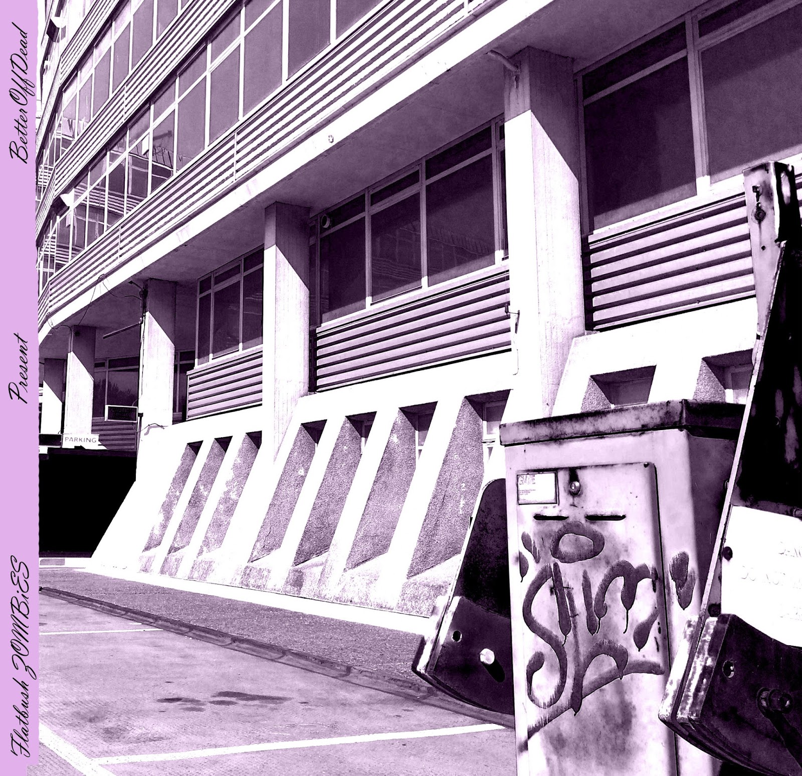
This is the inside fold, the spine features the same text as the other one but is purple to match the image on the inside. The image is of an abandoned building I found and a broken barrier with graffiti on it. I increased the contrast to give the graffiti and shadows an interesting effect and then made the image black & white and added a pale purple filter. The colour purple is often linked to hip-hop especially recently as many famous rappers drink an illegal drink called 'Lean'.

I decided to change the spine and carry on the theme of the back cover bleeding over.

Complete view of 1st side of digipak


This is where the spine would be but on the inside, it is influenced by the cover of Kanye West's '808's and Heartbreak'. I decided to make a black & white version to convey the darkness of the group's music and one that is the same colour as the gradient on the outside of the digipack.

- Kanye West's '808's & Heartbreak'

This is one of the inside panels of my digipack, it represents the 'hood' and how people are trapped inside it, this is shown by the fence which even makes it look almost prison like, this photograph would go by the black and grey spine. I made the image black & white so it seemed darker and more entrapping, I then added a filter to make it look more professional.

This is the inside (minus the central piece), the image on the left is supposed to contrast the image on the right as it shows freedom and the bright-lights of fame. the colours are also quite psychedelic which fits the group's style and the coloured dashes are on this side.

This image will be under the disk and the disk will be printed so that the buyer can move his disk to create either a cross or an inverted cross.


Complete inside view - I added some crosses to carry a theme through. The cross on the right represents the fact that when people are trapped in hard times they look to things like religion whereas the one on the left represents the fact that when people get big and famous they leave behind religion.
Friday, 13 January 2017
CLPPNG Digipack - Clipping

The image from the cover of this album runs across three whole panels. The image is very unique for an album cover which is fitting as Clipping's music is very unique, the image is also quite distorted which fits their music as well. The back cover features the label's logo, the barcode and the legal/copyright information. The track list is on the inside of the case but continues the image from the outside.

The inside of the case features distorted images of the band, which continues the link to the band's distorted music. The inside, like the outside, is very minimalist which also fits the bands music as they have some extremely minimalist songs.
3001: A Laced Odyssey Digipack - Flatbush ZOMBiES

The cover of this album features a brightly coloured cartoon image, this fits very well with the bands 'druggy' image. There is also a checked strip down the side which is very eye-catching. The Cartoon features images like a tank, the devil and a savage dog which fit well into the violence that is frequently included in the lyrics of the band's image.
The album title and the track list are on the back of the album and are written in a handwritten style. There is also bandana style patterns around the edges and some legal information at the bottom.


The Powers That B Digipack - Death Grips

The album features a floor light with Death Grips scratched into which suits their image well as they are very aggressive musically. The back cover features a heavily distorted screenshot from one of the group's music videos as well as the album title and the legal information and also the label logos.
The images from inside are very minimalist, one just says 'Jenny Death' and the other says 'Ni**as On The Moon' and features an image of one of the group's members. 'Jenny Death' and 'Ni**as On The Moon' are the names of the disks that together make 'The Powers That B'.

The images on the far left and far right feature an image of the same thing, a 'real' leaf within a computer screen that has an editing software on the screen, but one of the images is from below the leaf and one is from above. This is very strange and unique which fits the band as these words are commonly used to describe them. The track listings are written over these images.
The disks feature distorted images which links to the heavy distortion featured in the music that Death Grips make.

The images below the disks feature blank snakes wrapped around red egg-like objects. This fits the dark and almost evil style of the music that they make. These images are also very cult-like which links to the 'cult' following that the band have.
Watch the Throne Digipack - Kanye West & Jay Z


The inside of the album is a lot different to the outside as it is much darker, this darkness and use of the colour black, although different to the gold, is just as fitting within the aesthetic of the hip-hop genre. The fact that Jay Z and Kanye's faces have been merged with wild animals suggests there will be aggression on the album and the inclusion of the USA flag shows the pride they feel for their nation and also fits into Kanye's future intentions of running for president. The angel down the bottom also helps to show their faith, the use of an angel and the USA flag could also show that they are very faithful to both their religion and their country.

The spine on the sides simply say the artist names and the album title.


Subscribe to:
Posts (Atom)